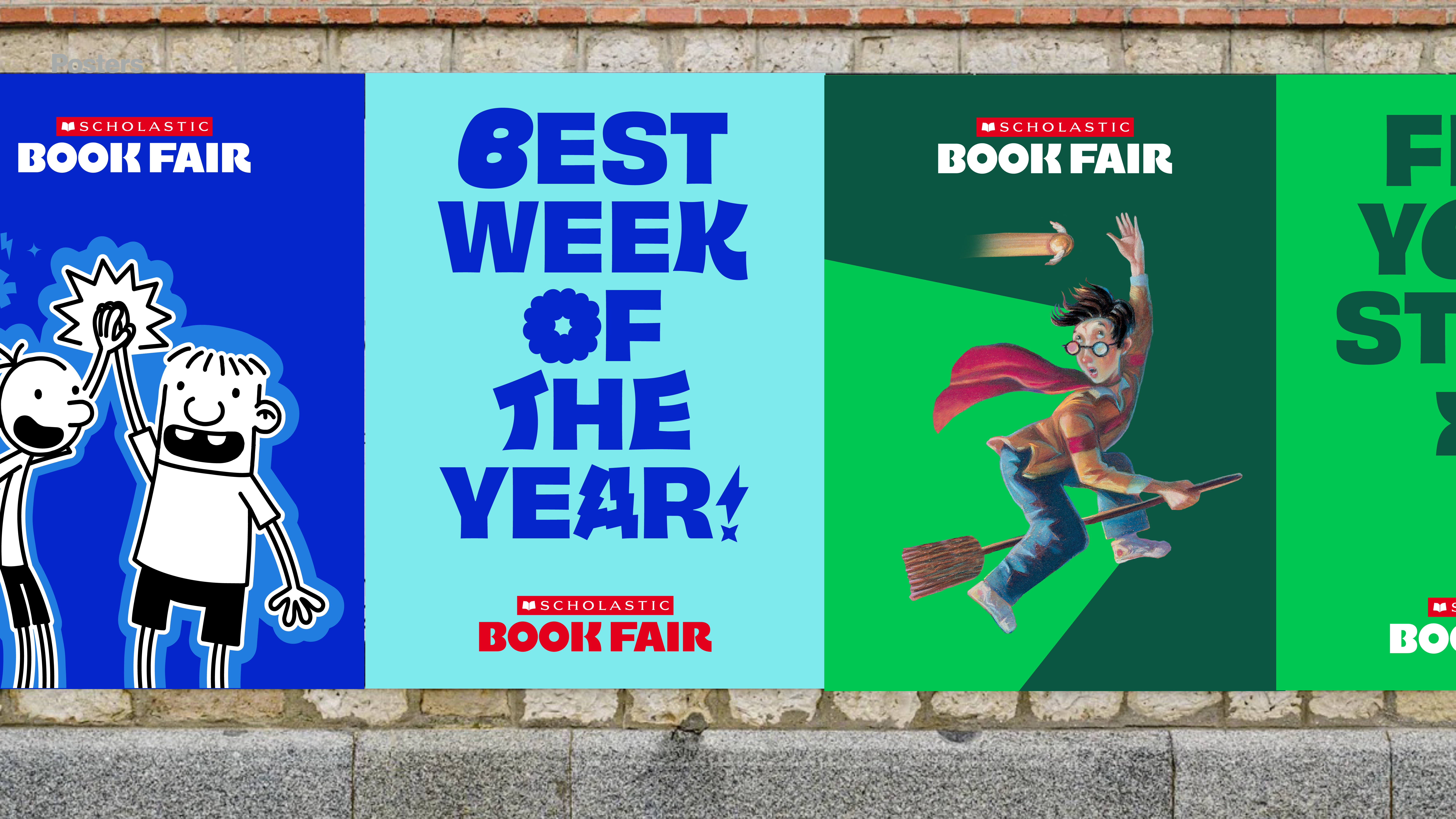
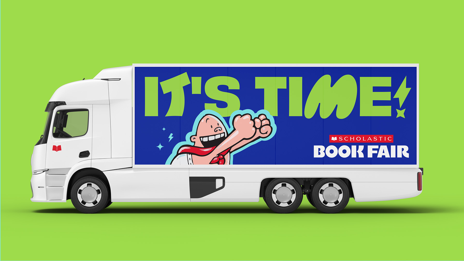
Scholastic Book Fair
A wonderful ruckus that combines the excitement of school, the magic of books, and the possibility of worlds they contain.
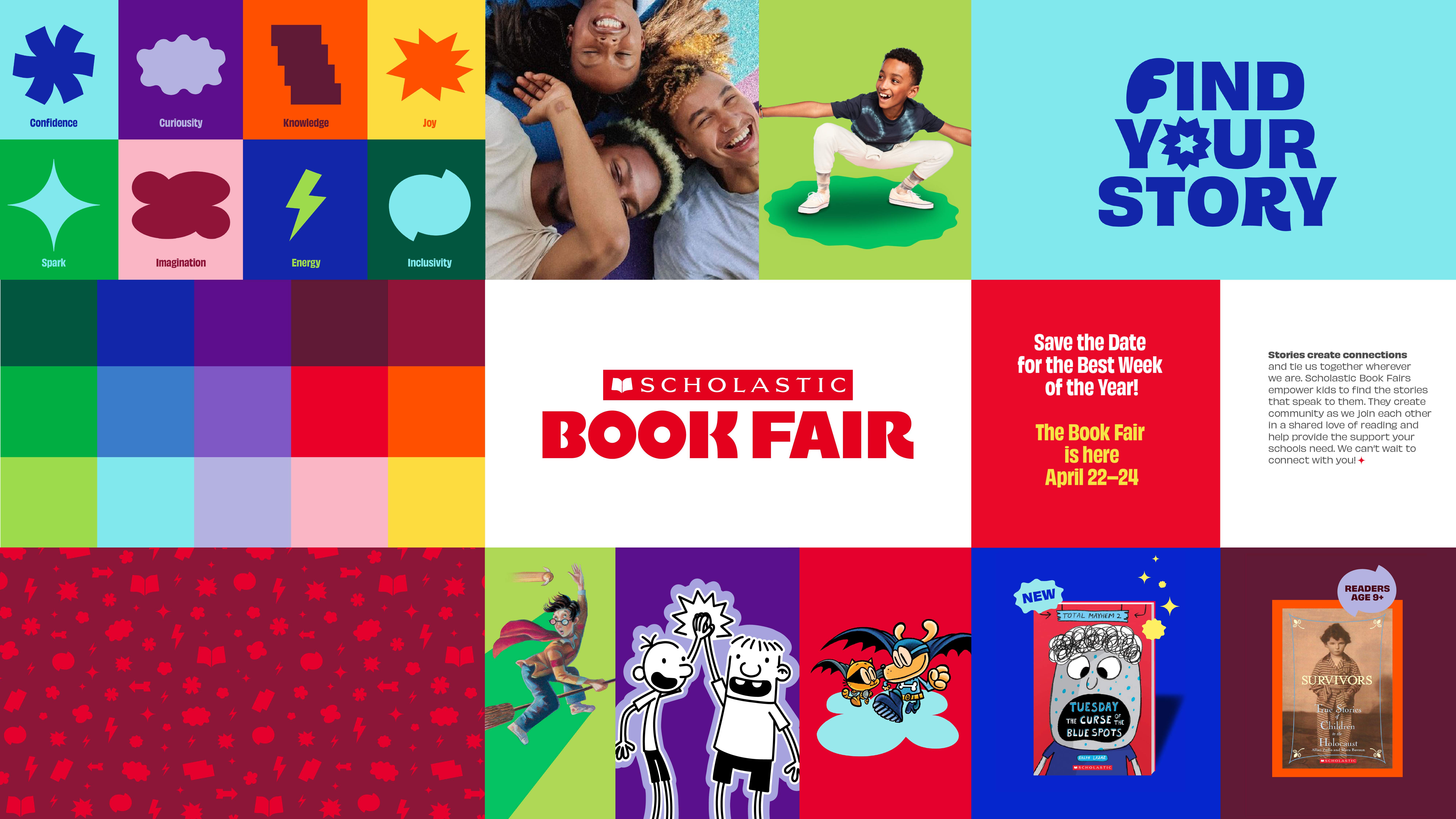
The bold and energetic identity leans into Scholastic equities as well as the impactful experience of the fair itself. All aspects of the fair aim to empower kids to choose the books of their liking, igniting their wide-eyed bookjoy.
Strategic principles of Curious by Nature, Exuberantly Impactful, and Everyone’s Invited led our design process.
My Role ︎︎︎ Designer
Field ︎︎︎ Brand Identity, Type Design
Typefaces ︎︎︎ Obviously Ruckus by Oh No Type Co. in close collaboration with the larger JKR team, Obviously by Oh No Type Co.
Team ︎︎︎ DESIGN: Katie Rominger, Emilie Hahn, Nicholas Claure, Julia Grippo / GCD: Rich Greco / STRATEGY: Kimberly Dixon-Mays / AD: Izzy Taaffe / MOTION: Griffin Keller / COPY: Joe Schott
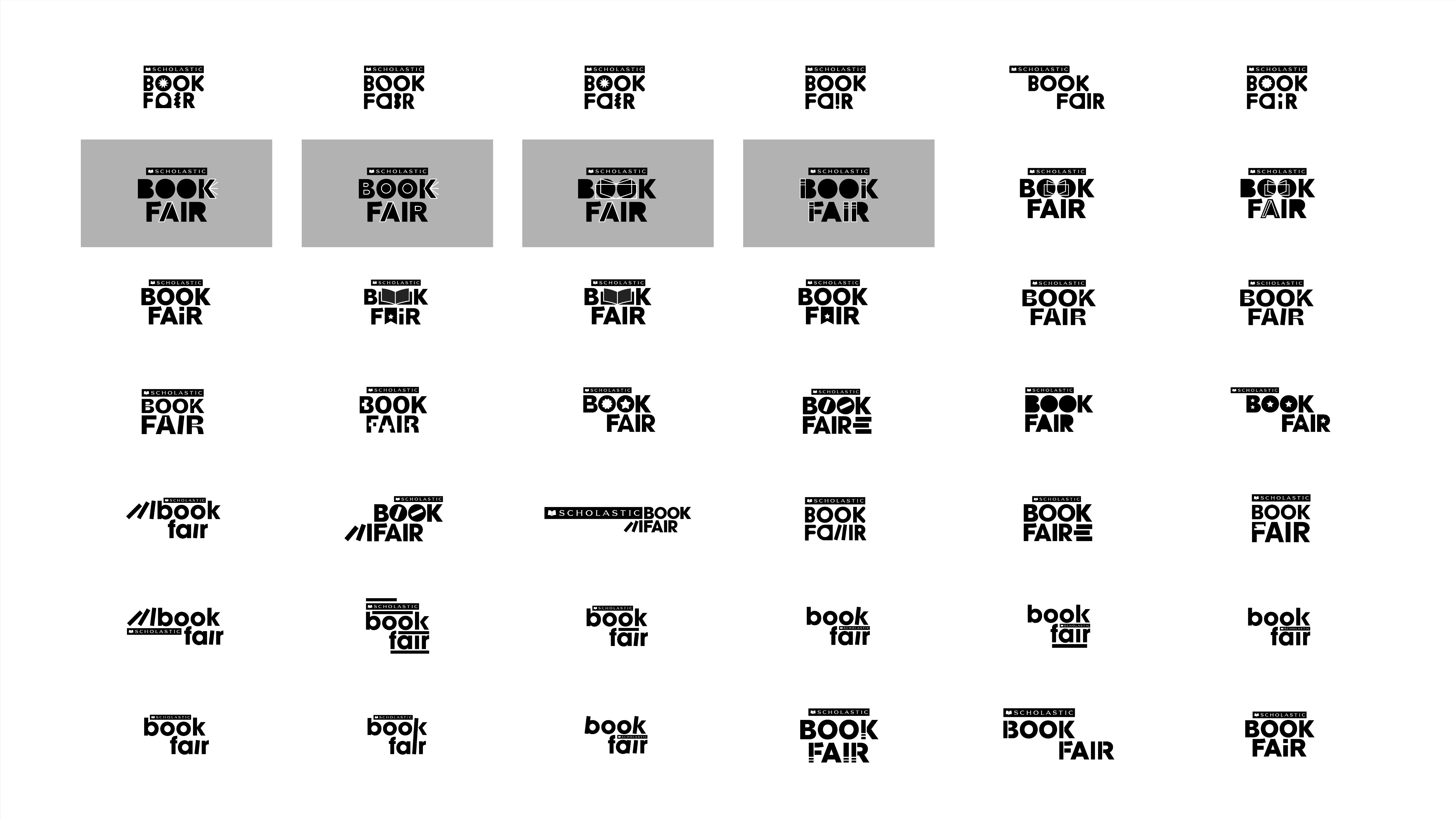
Derived from Books
Our custom wordmark features bold, playful letterforms that capture the energy of the fair. The swing in the legs of the “K” and “R” are a nod to the flying pages motif in the Scholastic mark. ![]()


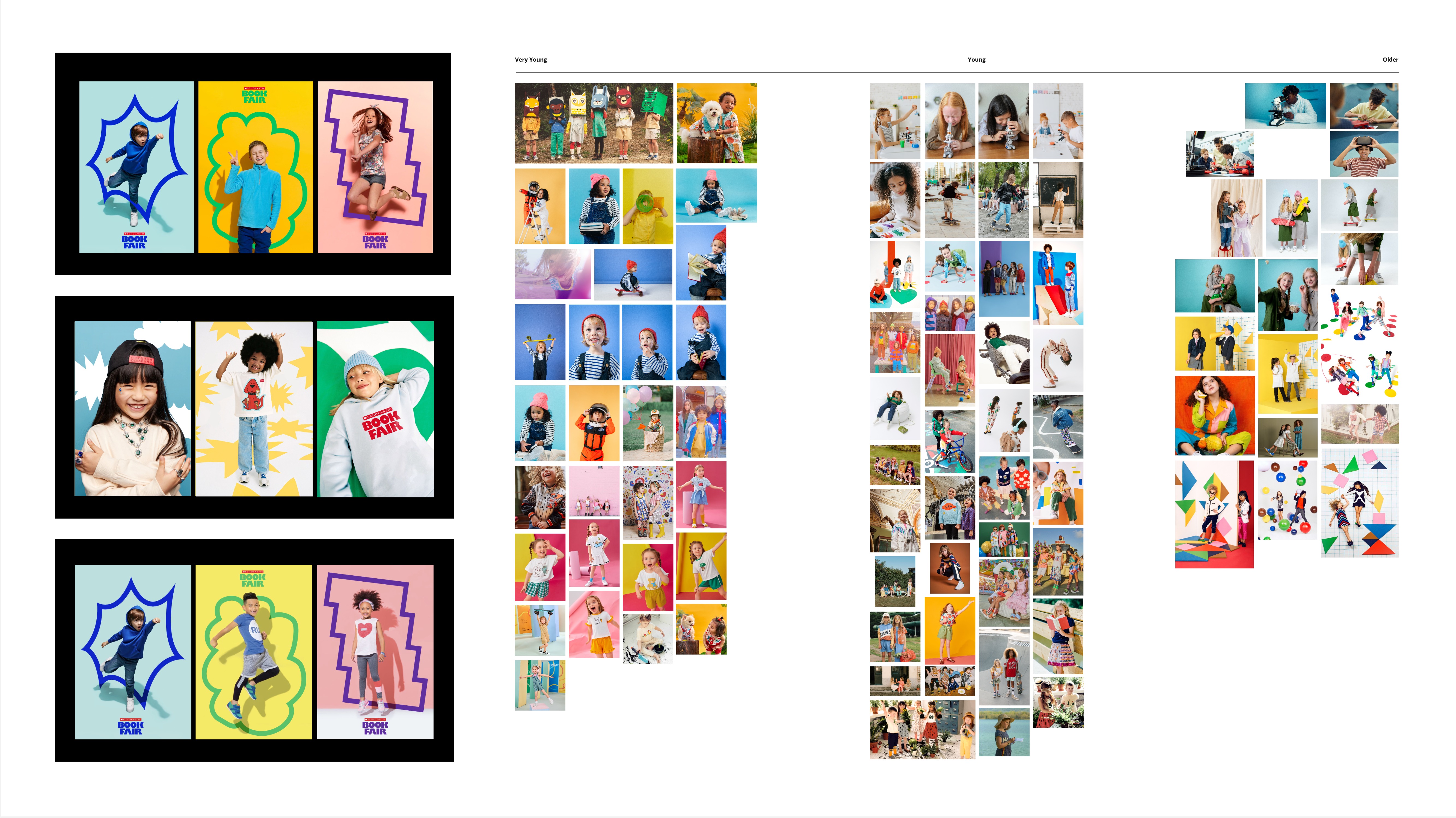
Emphasizing Discovery & Joy
The “Bookjoy Shapes” are inspired by our custom headline typeface. They can be used as platforms for characters, badges or call-outs that identify reader age-ranges, or backdrops for portrait photography.
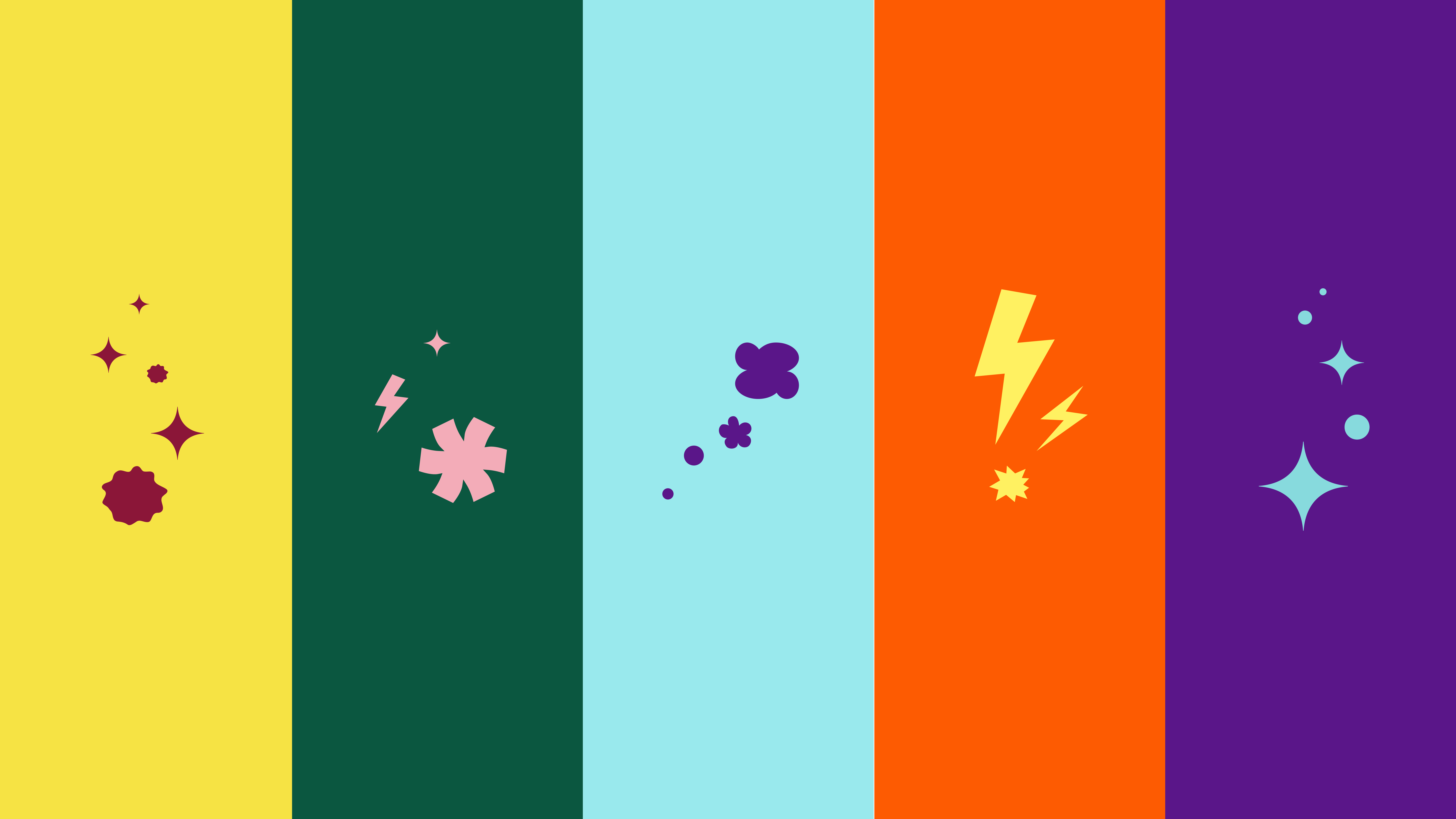
Our “Bookjoy Sparks” emphasize those magic moments of discovery and joy. Derived from the “Bookjoy Shapes,” they can be used for additional visual texture.
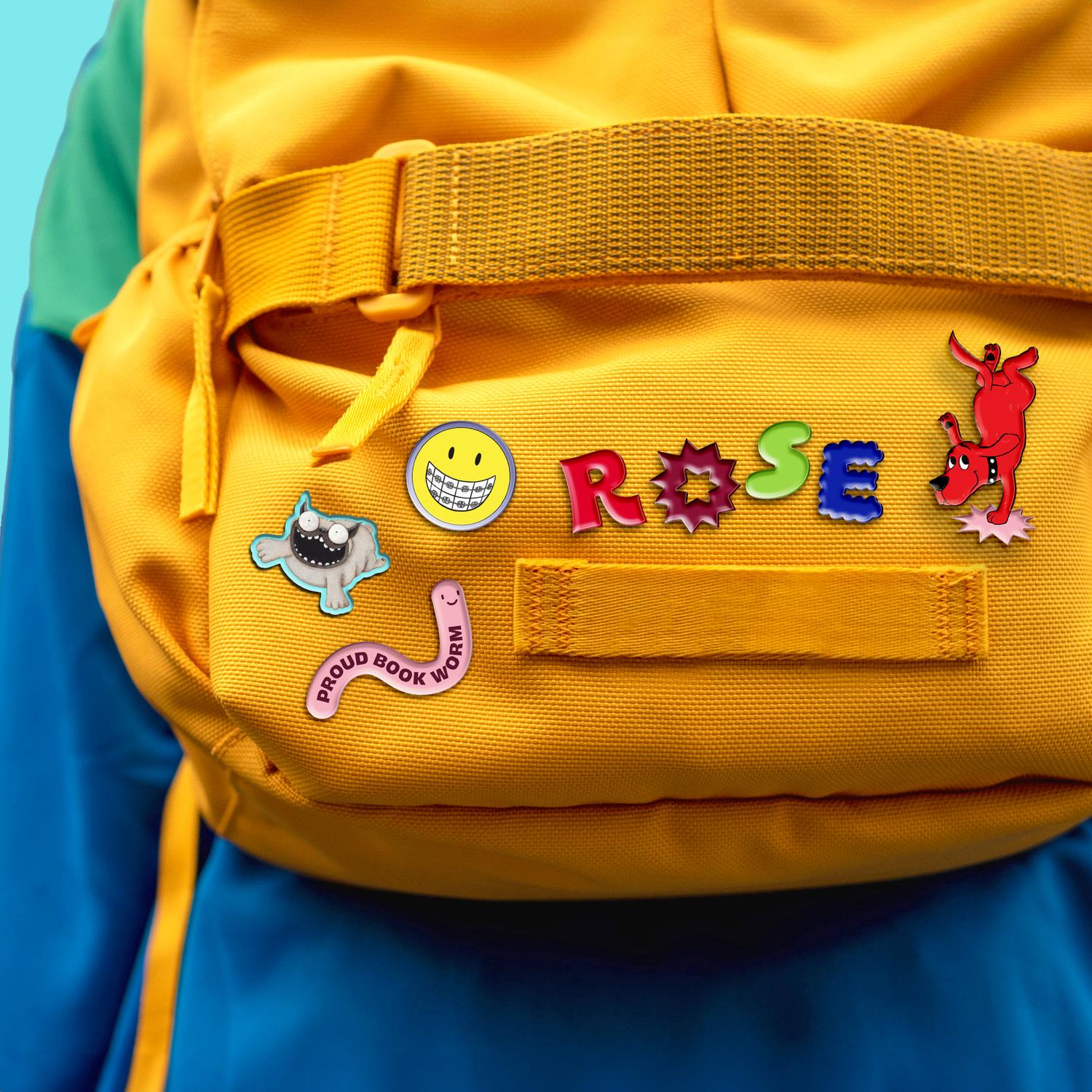
The stickers bring personality and personalization to social content.
Our “Bookjoy Sparks” emphasize those magic moments of discovery and joy. Derived from the “Bookjoy Shapes,” they can be used for additional visual texture.

Inspired by Emotion
Our custom typeface, Obviously Ruckus, features custom glyphs which capture the vast array of emotions experienced at the book fair.
Using four distinct categories (confidence, curiosity, energy, and imagination) for style inspiration, we partnered with OH No Type Company to create a unique alphabet of glpyhs that can be used alongside Obviously Bold.


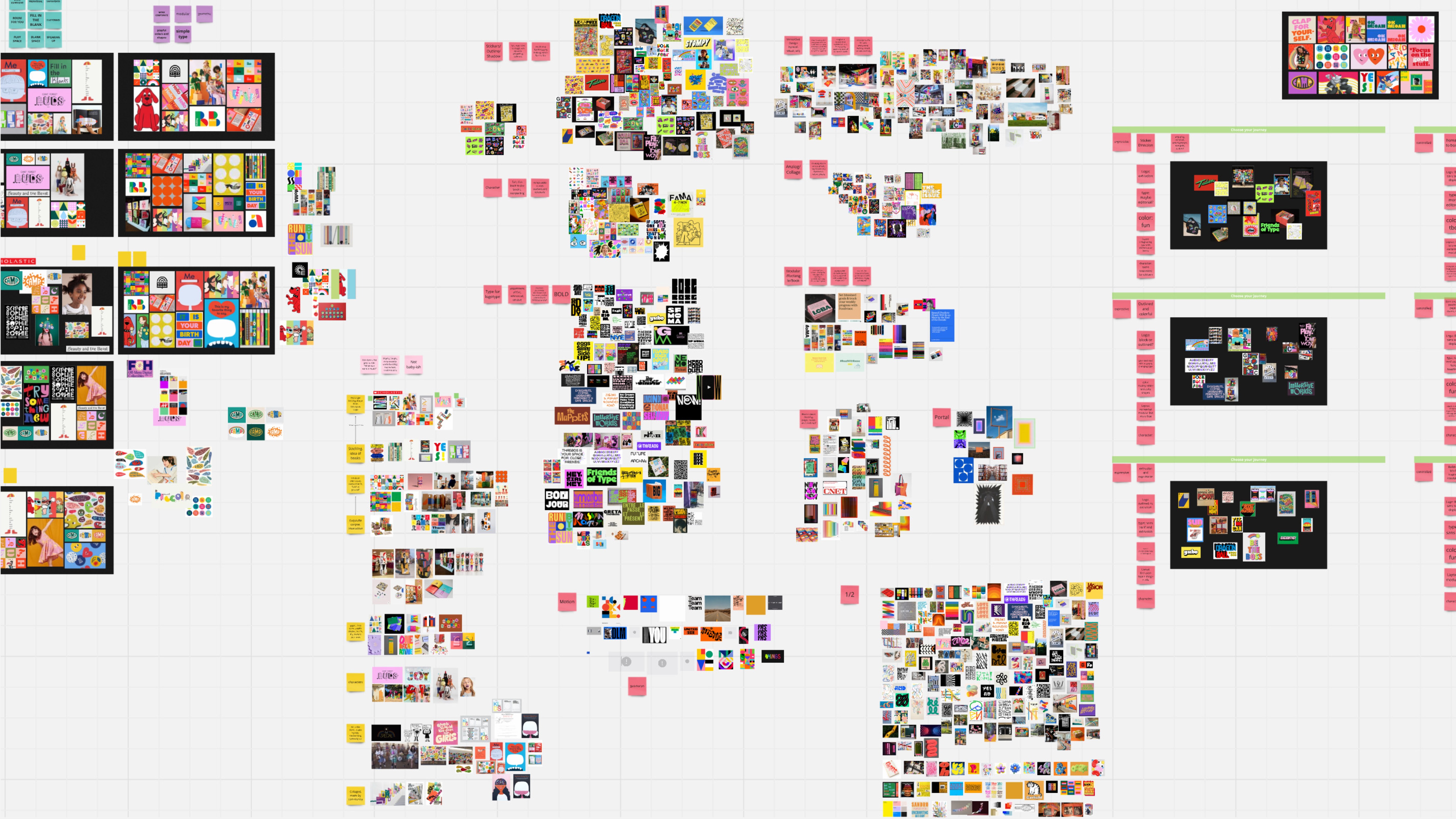
Process Work
Everything from swipe pulling to moodboards to initial design directions, logo and type sketches, you’ll find it here!