Cloud+
(Apple Watch Redesign)
Brief
Redesign the face of the Apple Watch in order to change the way time is read (flows).
Solution
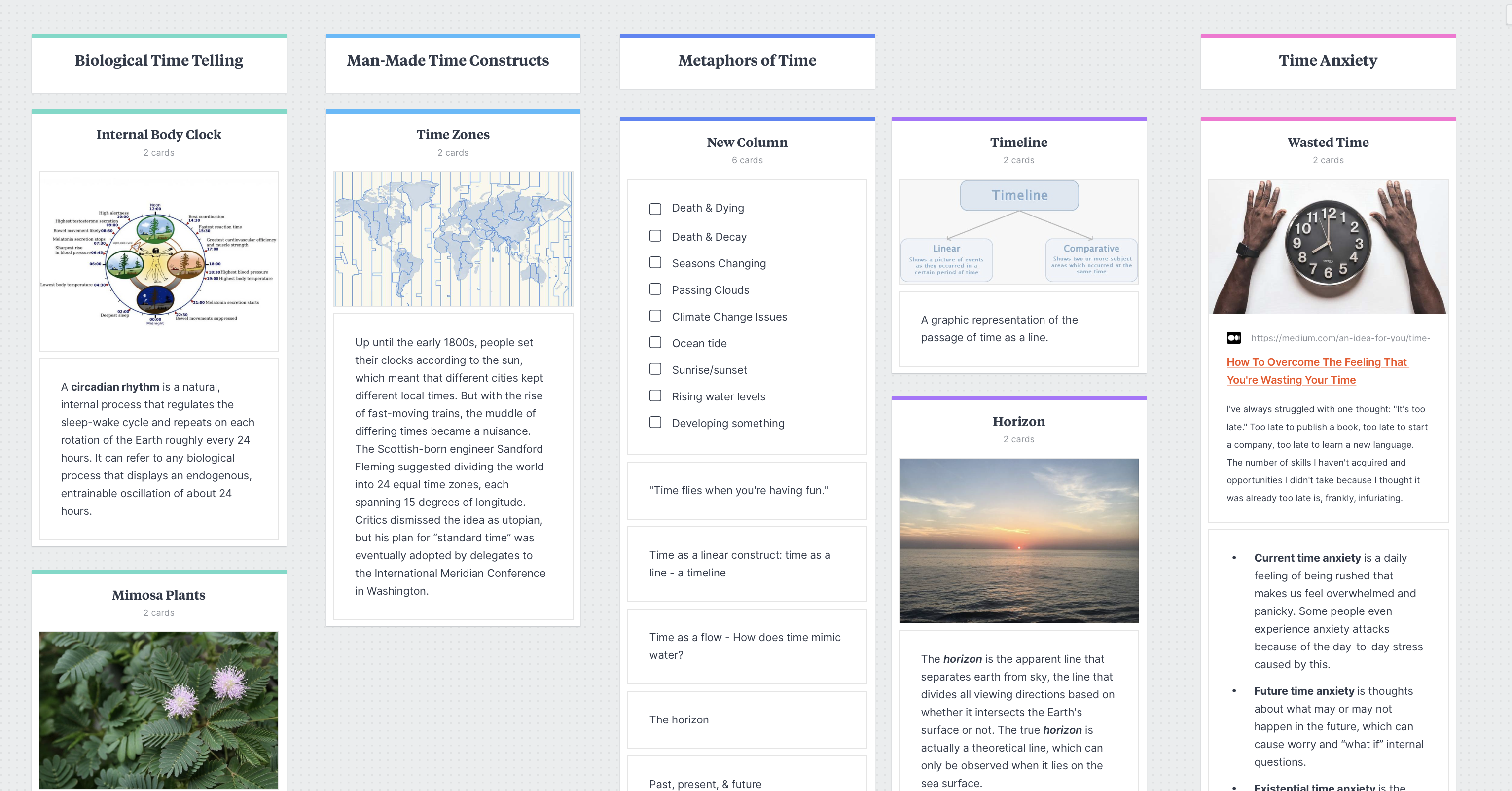
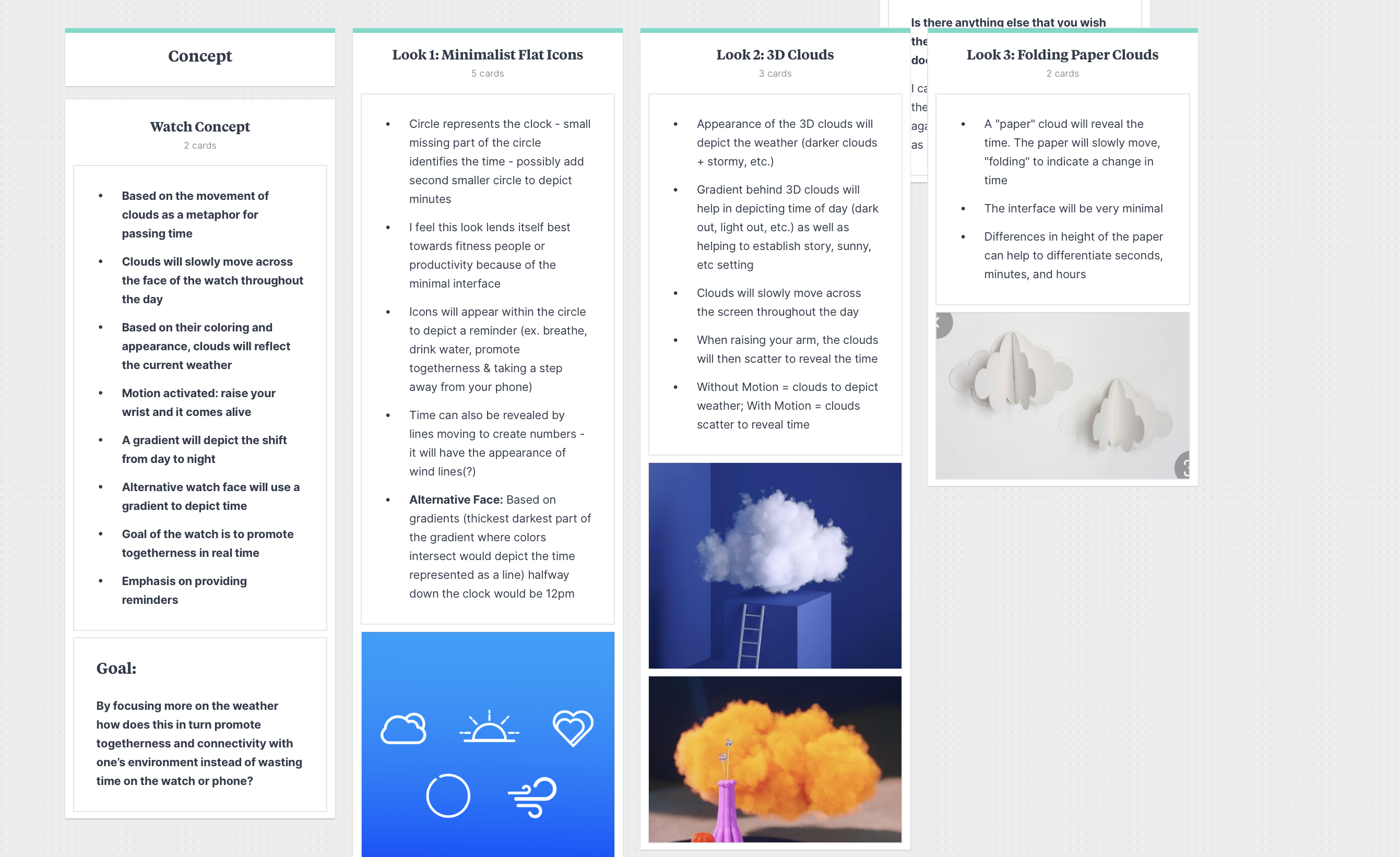
Cloud+ is a redesign of the Apple Watch based around the idea of clouds as a metaphor for passing time. Through integration of human-center design I was able to create personas and prototypes to create a 360 design that feels real. The main promo image features the watches in a cloud-like shape to tie the advertising back into the product.
Redesign the face of the Apple Watch in order to change the way time is read (flows).
Solution
Cloud+ is a redesign of the Apple Watch based around the idea of clouds as a metaphor for passing time. Through integration of human-center design I was able to create personas and prototypes to create a 360 design that feels real. The main promo image features the watches in a cloud-like shape to tie the advertising back into the product.
Field ︎︎︎ UI/UX Design, Interaction Design, Motion Design
Typefaces ︎︎︎ Druk by Commercial Type, Narly by Emigre, Neue Haas Grotesk Display Pro by Linotype


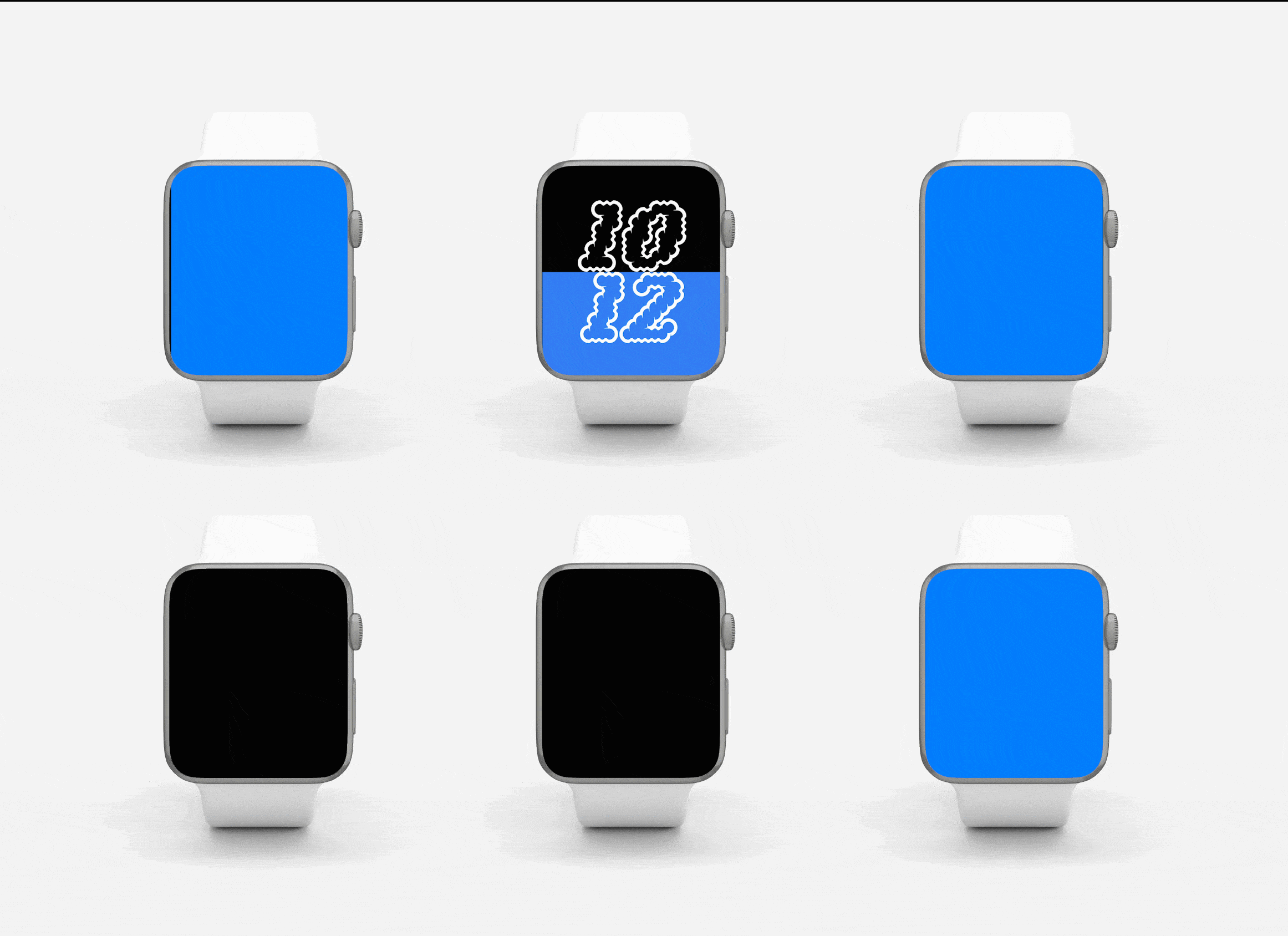
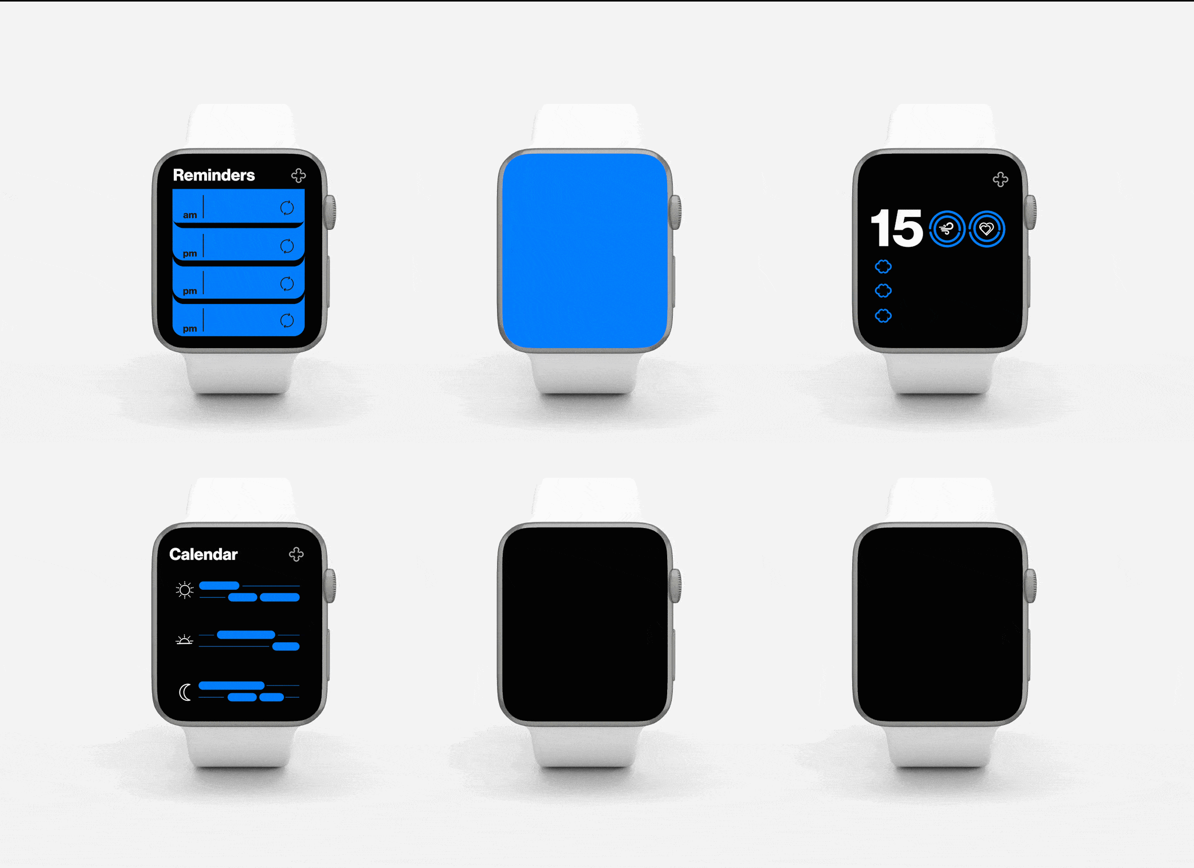
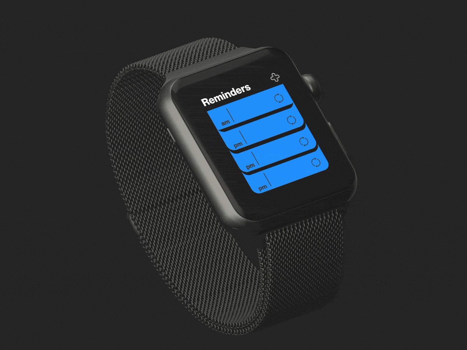


Crafting the Visual Assets


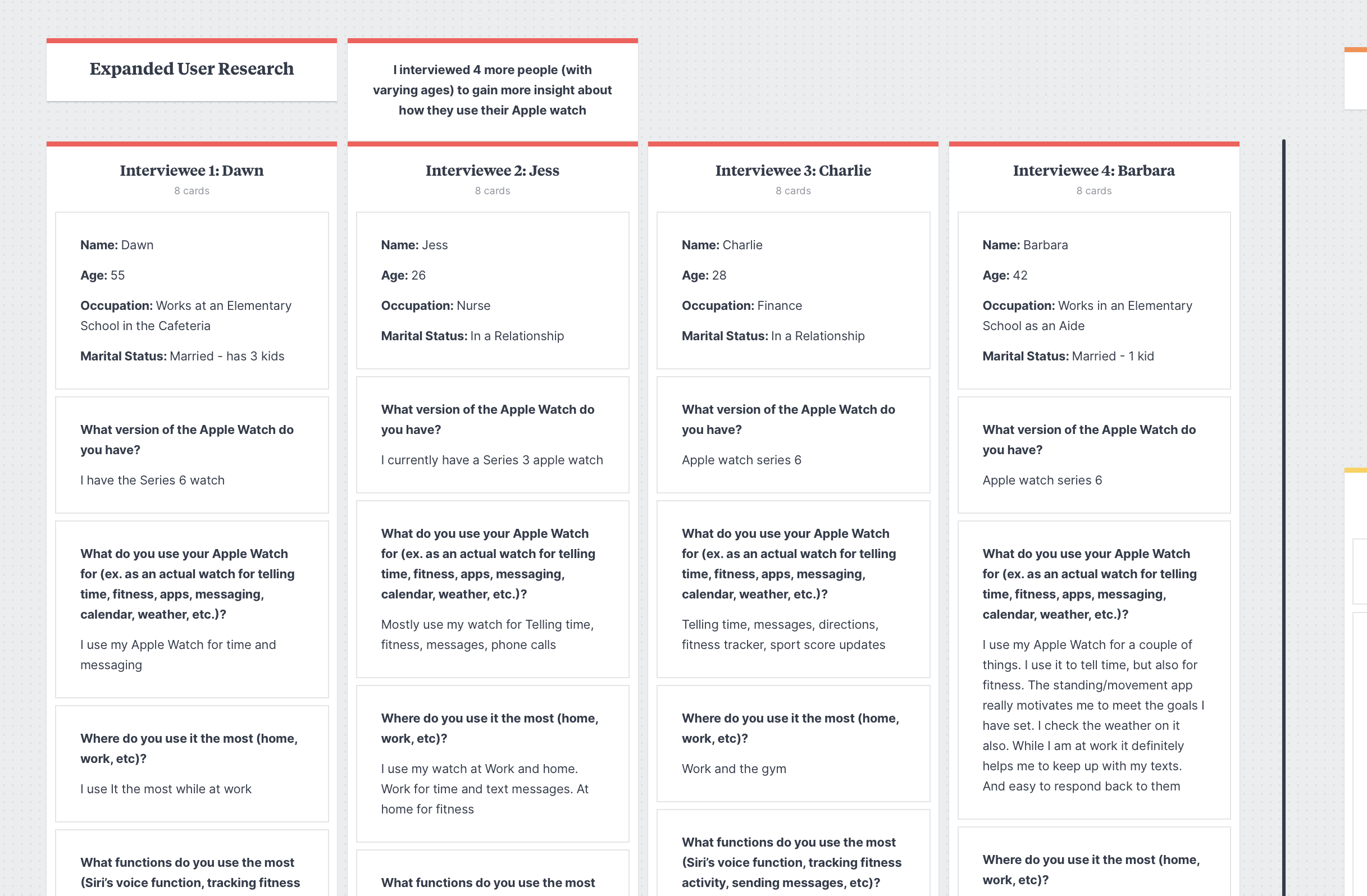
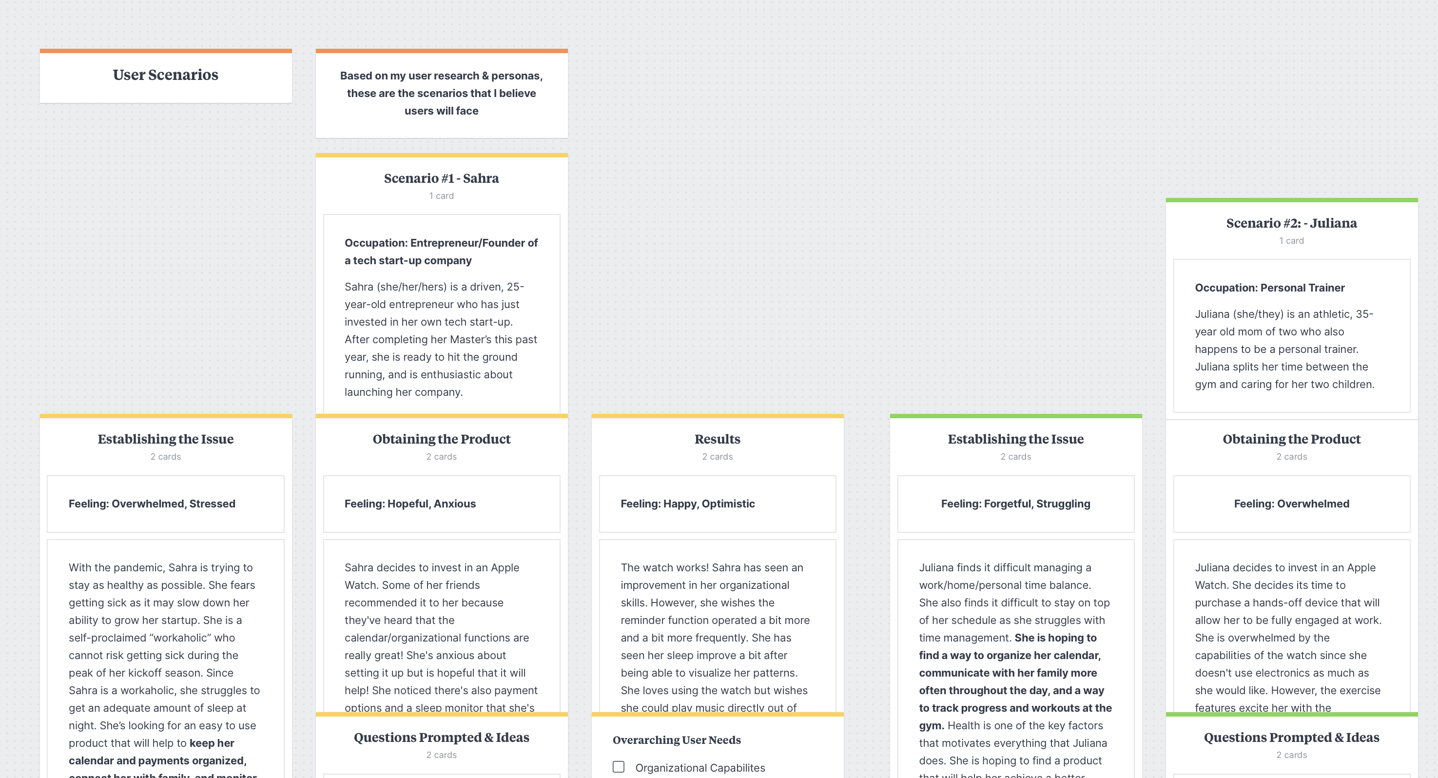
Establishing User Personas

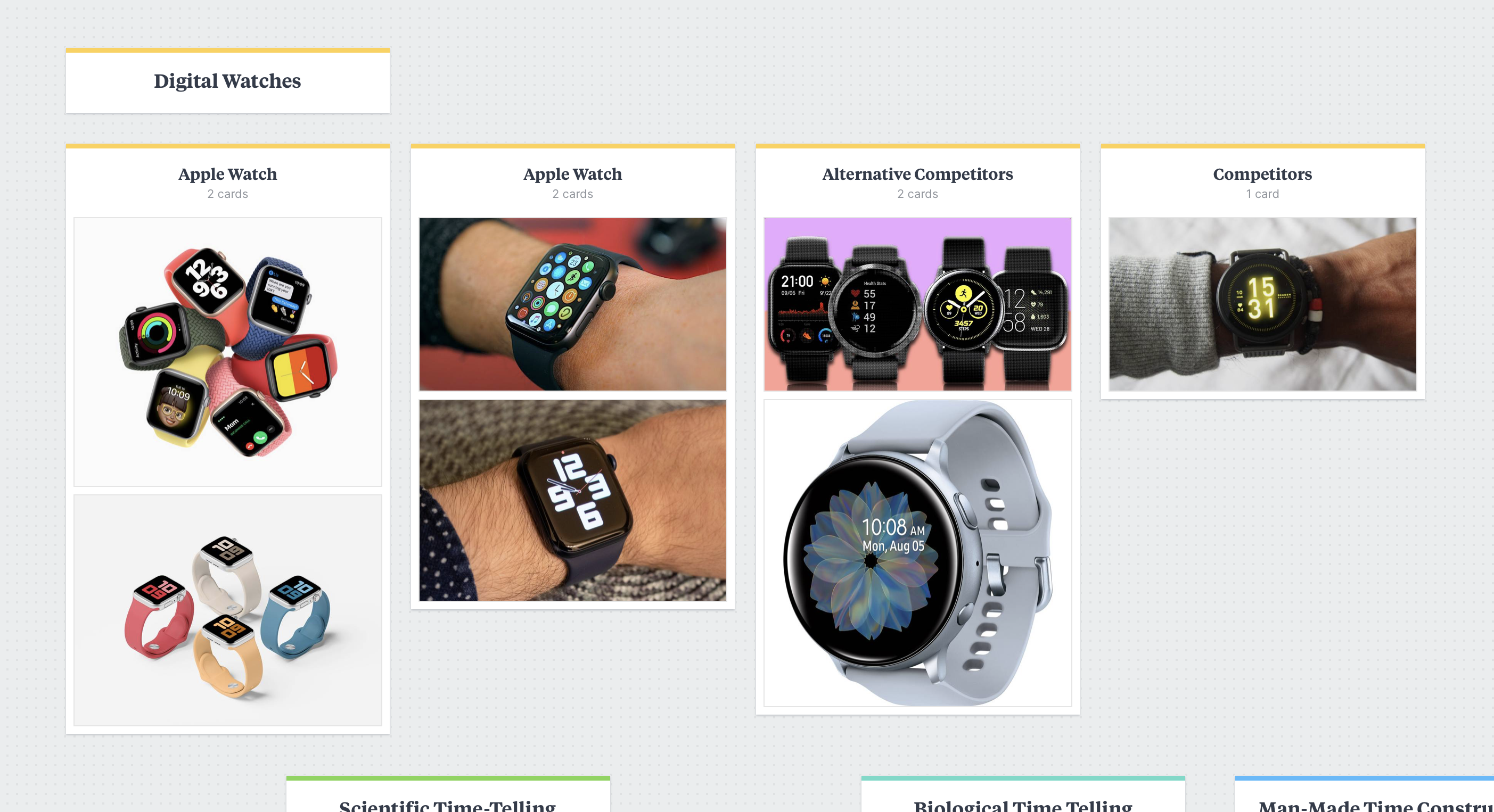
Research & Development
Research including user interviews was conducted to find out more about the subject, potential users, and competitor products.