Chime
Chime empowers individuals to foster financial peace of mind, disrupt the status quo, and unlock financial progress. Chime's new purpose and brand identity disrupts the conventions of traditional banking by redefining what progress means and looks like for people today.
Designed to make financial progress as effortless as scrolling through your feed. It’s bold, it’s modern, and it’s here to shake up the way you think about money in 2024.
We’re empowering Chime’s community to own their financial journey.
JKR’s goal was to build a more relatable, more inclusive, and more seamless experience for consumers without sacrificing Chime’s personality.
My Role ︎︎︎ Designer
Field ︎︎︎ Brand Identity, Type Design
Typefaces ︎︎︎ Chime Serif and Chime Saans in collaboration with the teams at Colophon Foundry and Displaay
Illustration ︎︎︎ Marco Palmieri
Team ︎︎︎ DESIGN: Daniel Rocha, Patricia Mitiko Watanabe Morales, Olivia King, Taylor Woods / CD: Jimmy Alleman / ECD: Jason Little / STRATEGY: Scott Fogel, Cole McCloskey / COPY: Joe Schott, Madeline Masarik / MOTION: Kaitlyn Chandler, Griffin Keller, Isaac Riches, Andrew Stubbs Johnston / 3D: Mat Brown, Abeselom Kavelashvili
Chime Team ︎︎︎ Vineet Mehra, Renaldo A. Chapman, Ryan Brown, Lauren Lio, Kaye Oleo
Agency Partners ︎︎︎ TwentyFirstCenturyBrand and AKQA
Published ︎︎︎ September 2024
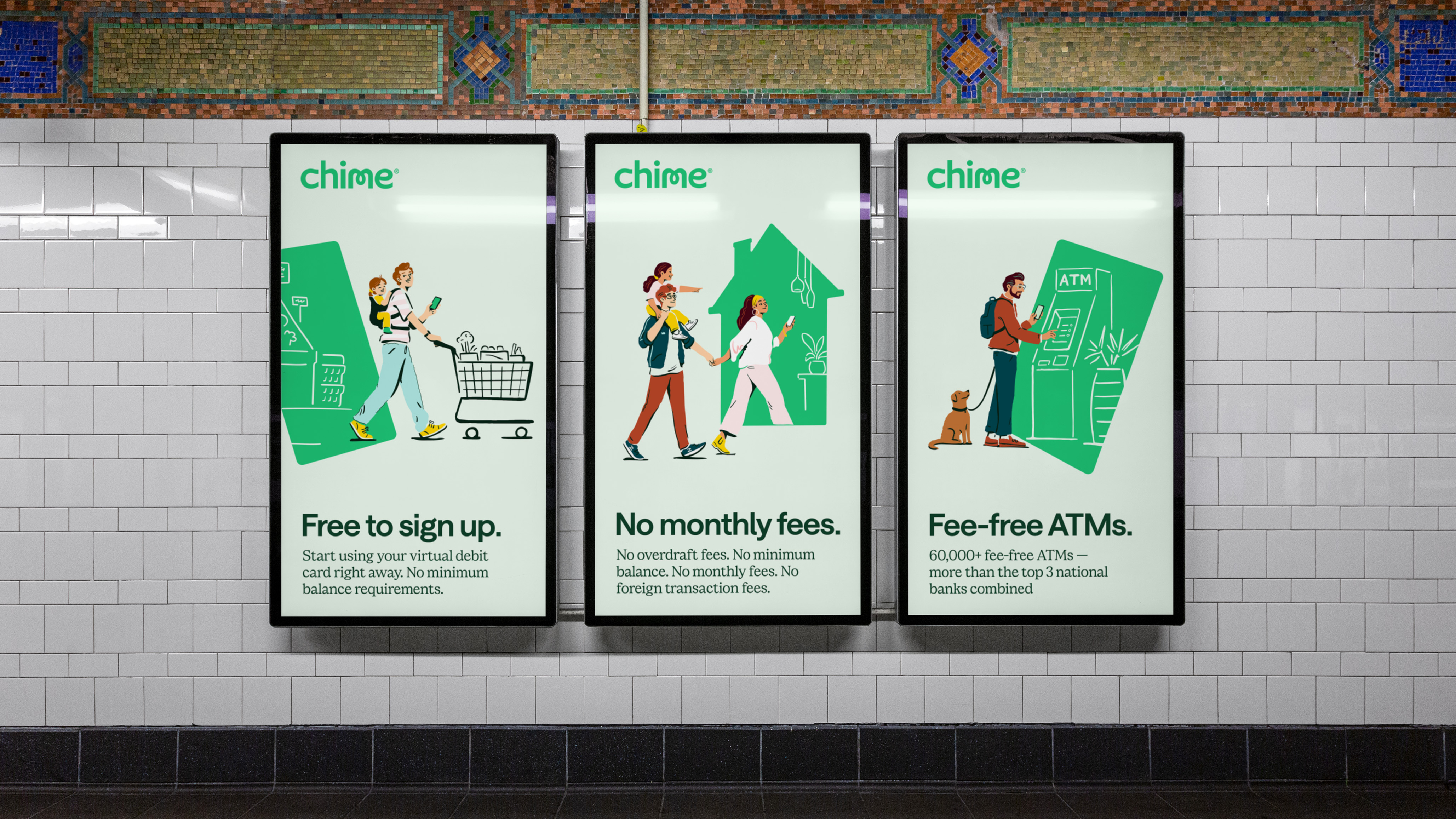
Portal to Progress
The design concept centers the brand around the idea of a “portal to progress,” evoking the ease with which Chime’s customers can manage financial advancement.
The updated identity strengthens the brands associations with trust and security, while disrupting traditional banking codes.
The green “portal” mirrors Chime's products, crafted to alleviate stress and streamline daily progress. By highlighting the synergy between the card and phone, the brand strengthens the connection between product usage and financial progress.
Capturing everyday purchase moments through vignettes and photography reinforces the idea that incremental steps and basic usage lead to progress, making the everyday more aspirational.


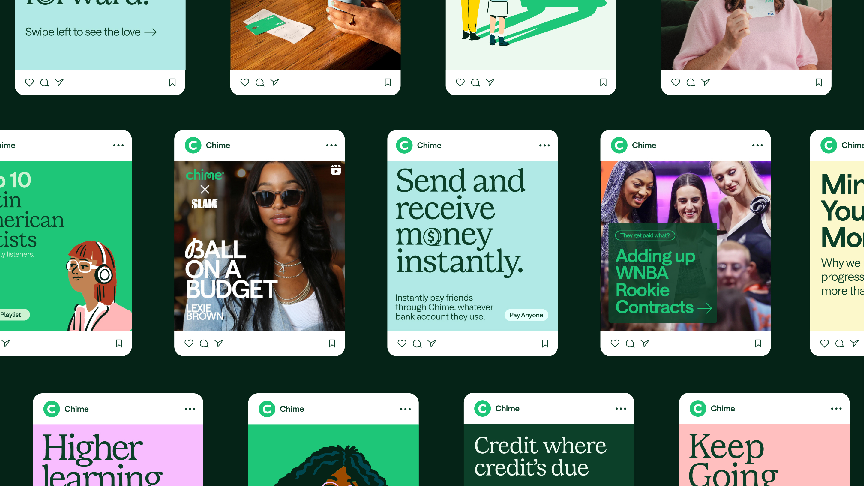
Real Customers
The new illustration approach is geared towards enhancing the relatability of the brand by depicting everyday moments.
Together with Marco Palmieri, we created a set of illustrations and animated scenes to add a human, artistic and friendly touch to the brand.
The previous dated vector style was replaced by a fresh hand-drawn style giving the brand an more unique and ownable look.
Our illustrations were crafted to celebrate diversity. The shift to a realistic illustration style ensures that the brand is more relatable and inclusive of Chime’s community.
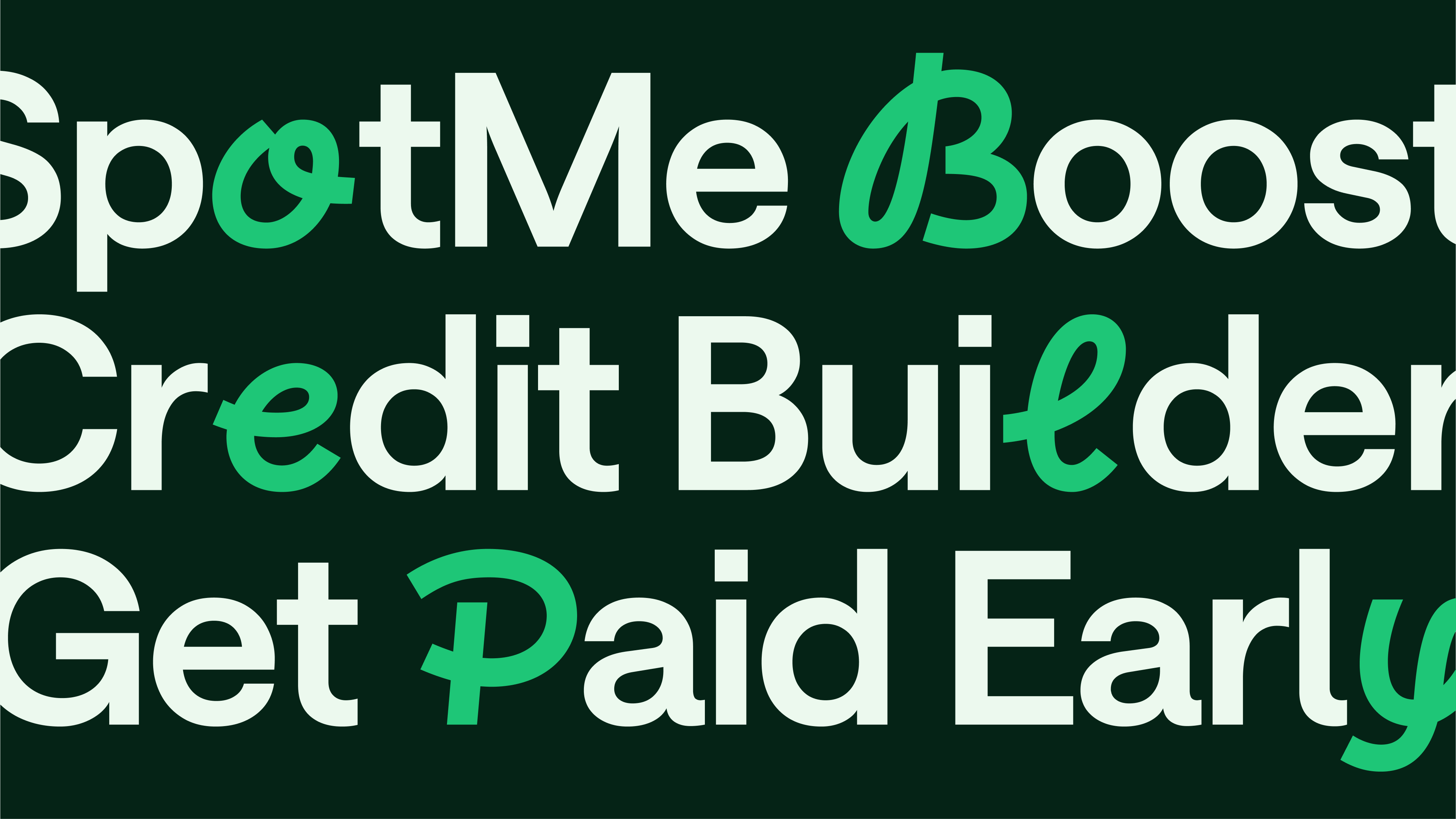
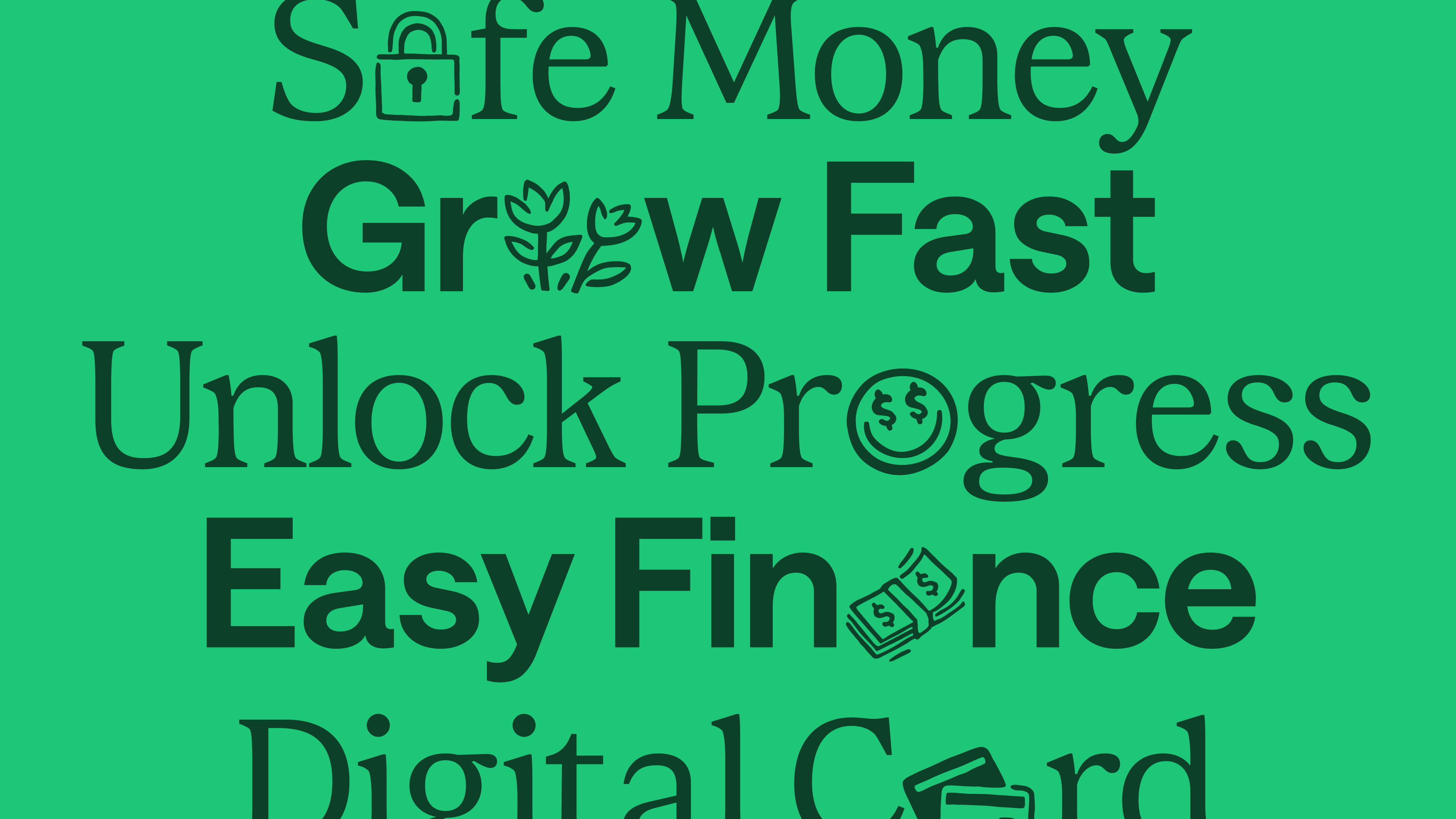
Enhancing Trust
& Unlocking Potential
“Unlocking” letters and replacing them with pictograms or expressive hand script alternatives brings a personal, human touch to showcase Chime’s personality.