America’s Big Deal
NBCUniversal
Brief
Develop concepts, logos, and styleframes for the new USA Network show, America’s Big Deal.
Solution
A set of four different design directions — complete with moodboards, styleframes, and motion tests. Various logos as well as 3D renders to bring the logos to life and add dimension.
Develop concepts, logos, and styleframes for the new USA Network show, America’s Big Deal.
Solution
A set of four different design directions — complete with moodboards, styleframes, and motion tests. Various logos as well as 3D renders to bring the logos to life and add dimension.





Design Direction 1:
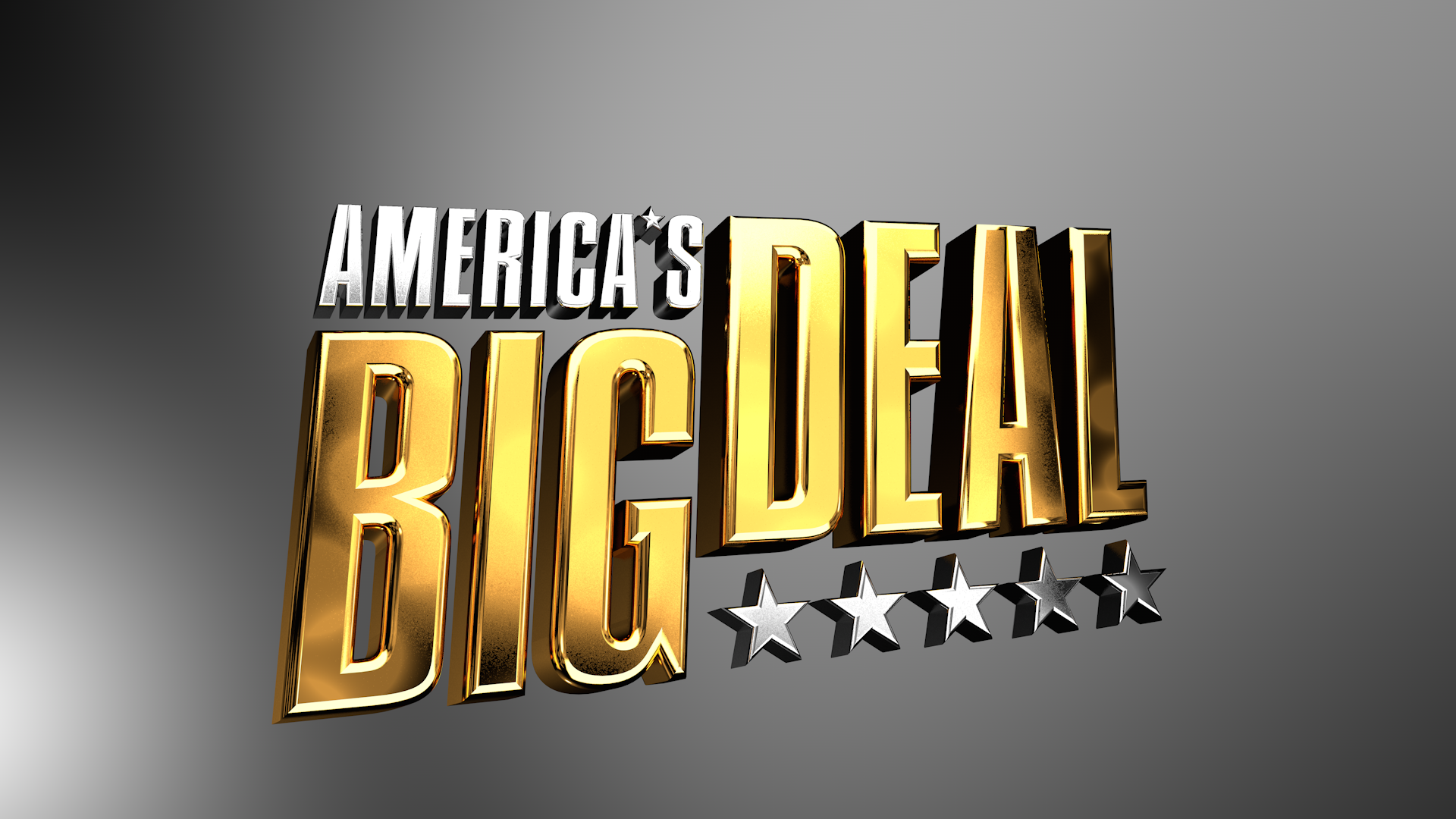
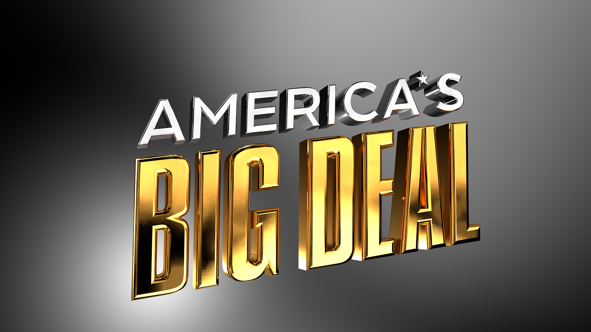
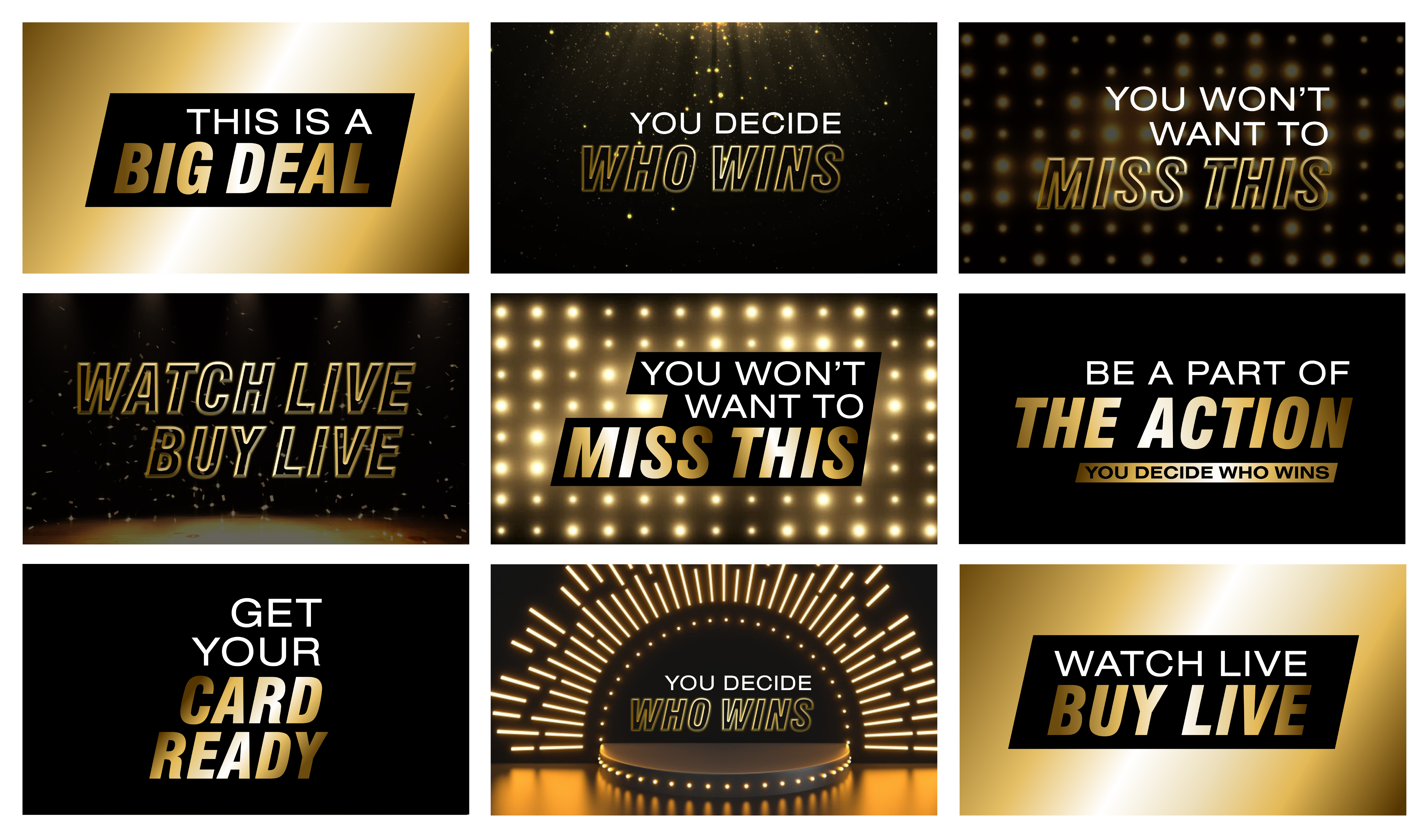
Golden Game Show
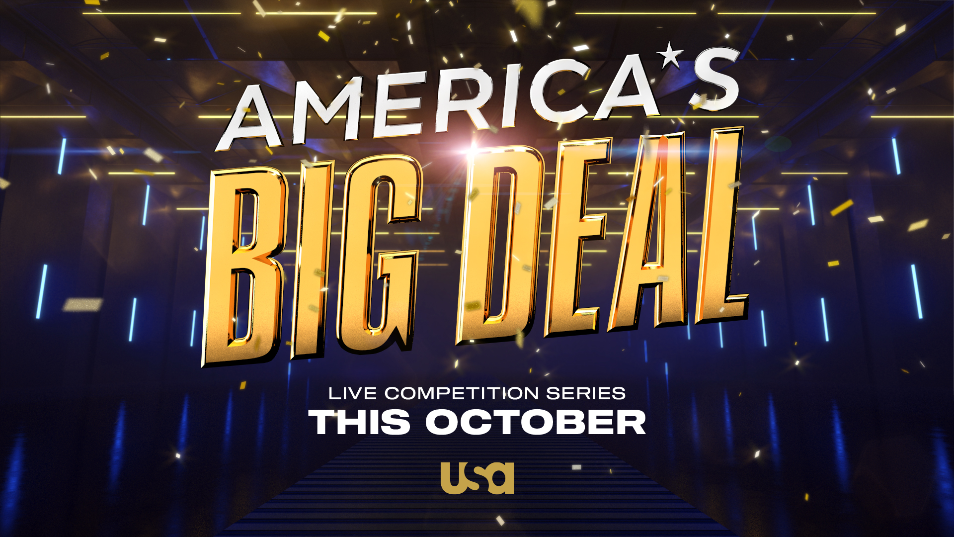
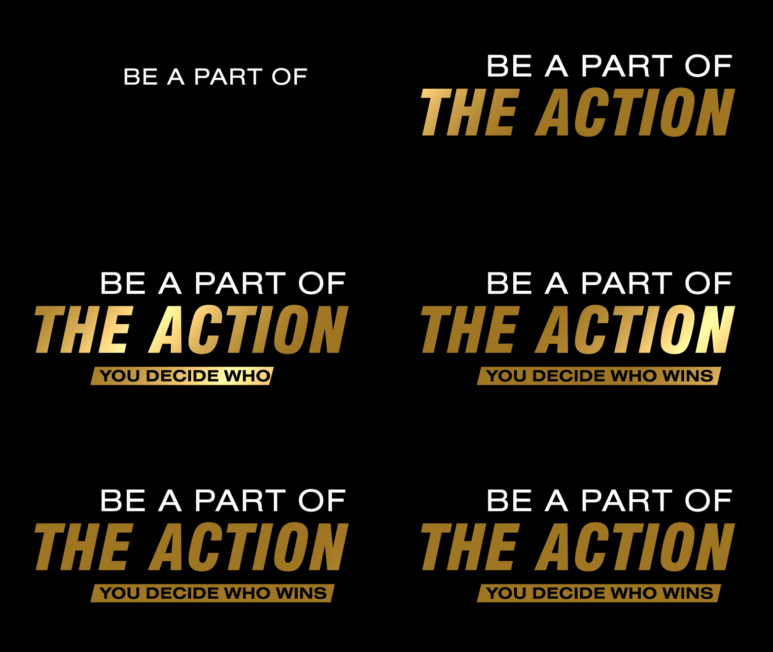
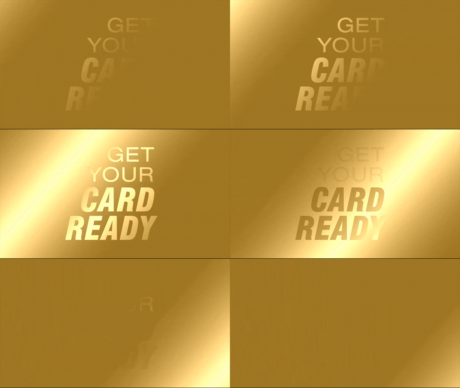
The white and gold color palette begins to match the aesthetic of the Newark Symphony Hall by playing on motifs of sophistication and elegance. By using lightsweeps and cameras in After Effects, we can achieve a shine effect over the text as the artificial light passes by. This shine effect can help to mimic the luster of gold while also introducing a contrast of light vs. dark. Golden gradients can/will also be used to achieve a similar effect. Glimmering, gold lights, and shiny confetti set the stage for our typography to shine. This aesthetic utilizes environmental photos from the ABD set as background plates. By incorporating an embossed outline on the gold font, we introduce a sense of contemporary elegance.

Design Direction 2:
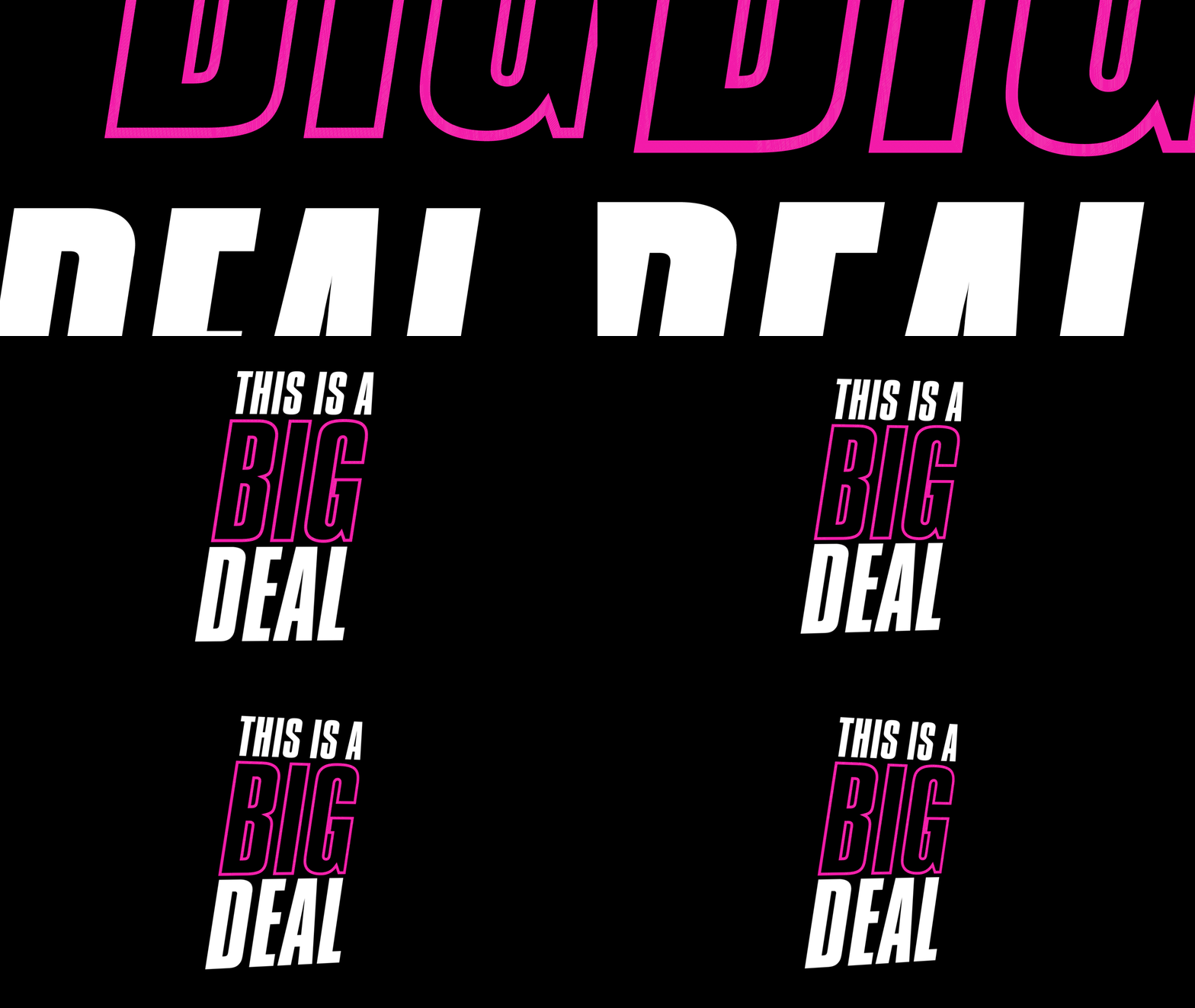
In Charge
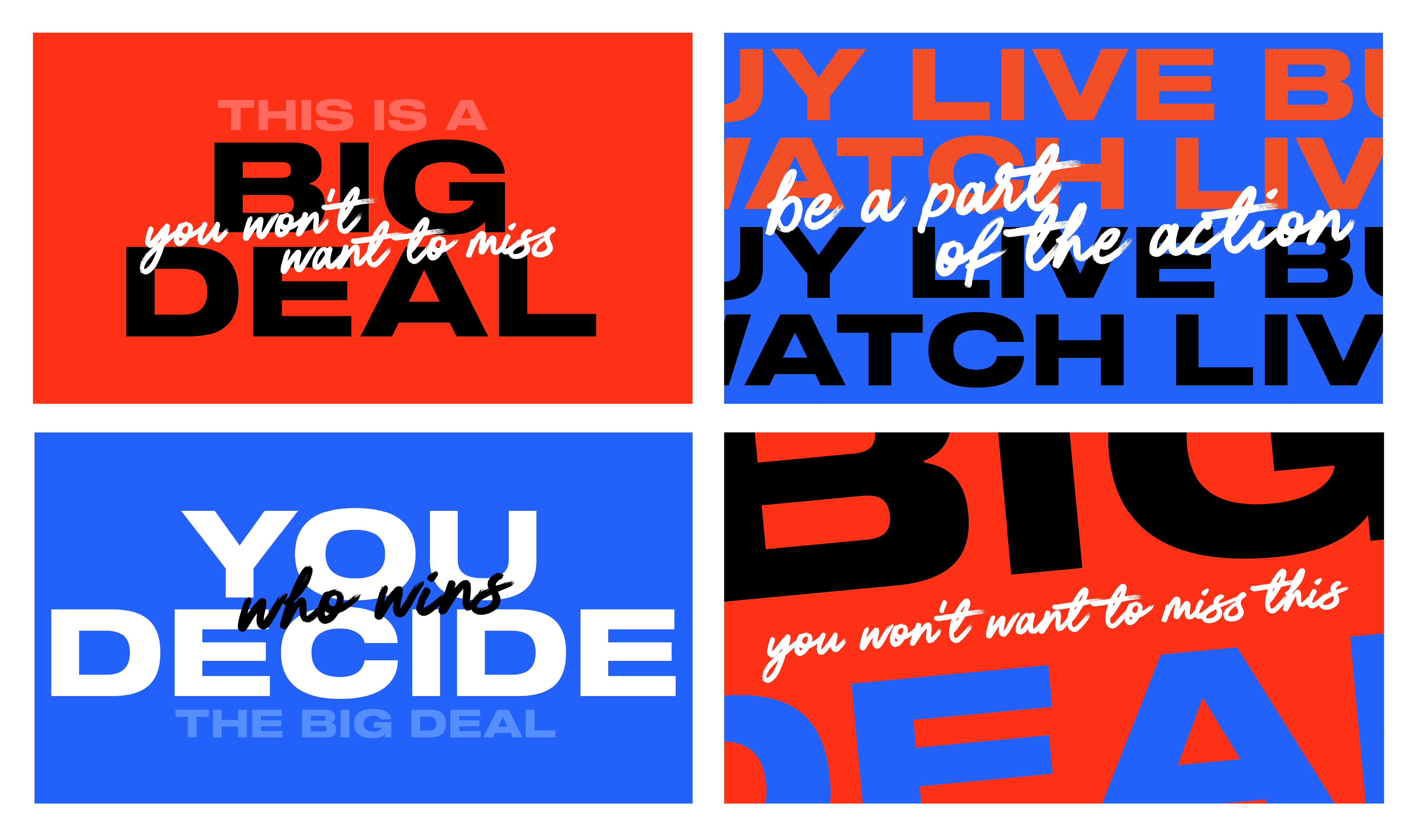
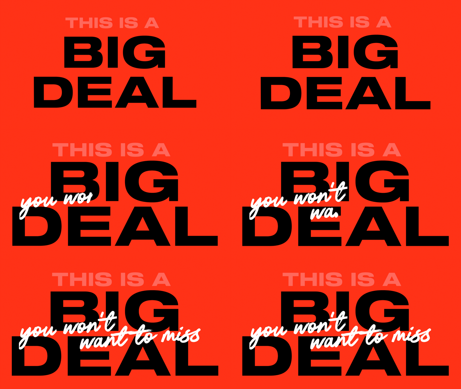
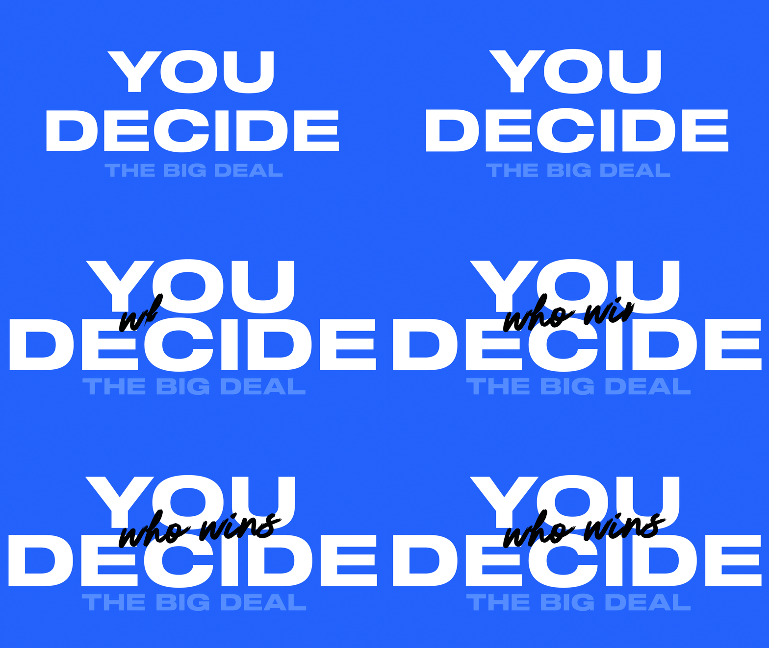
This aesthetic taps into the success story of a budding entrepreneur. A bold, condensed sans serif typeface will help in visualizing themes of strength and power. This approach will use typography to build excitement surrounding the show while providing an energetic burst that can help with appealing to a younger audience.



Design Direction 3:
Retail
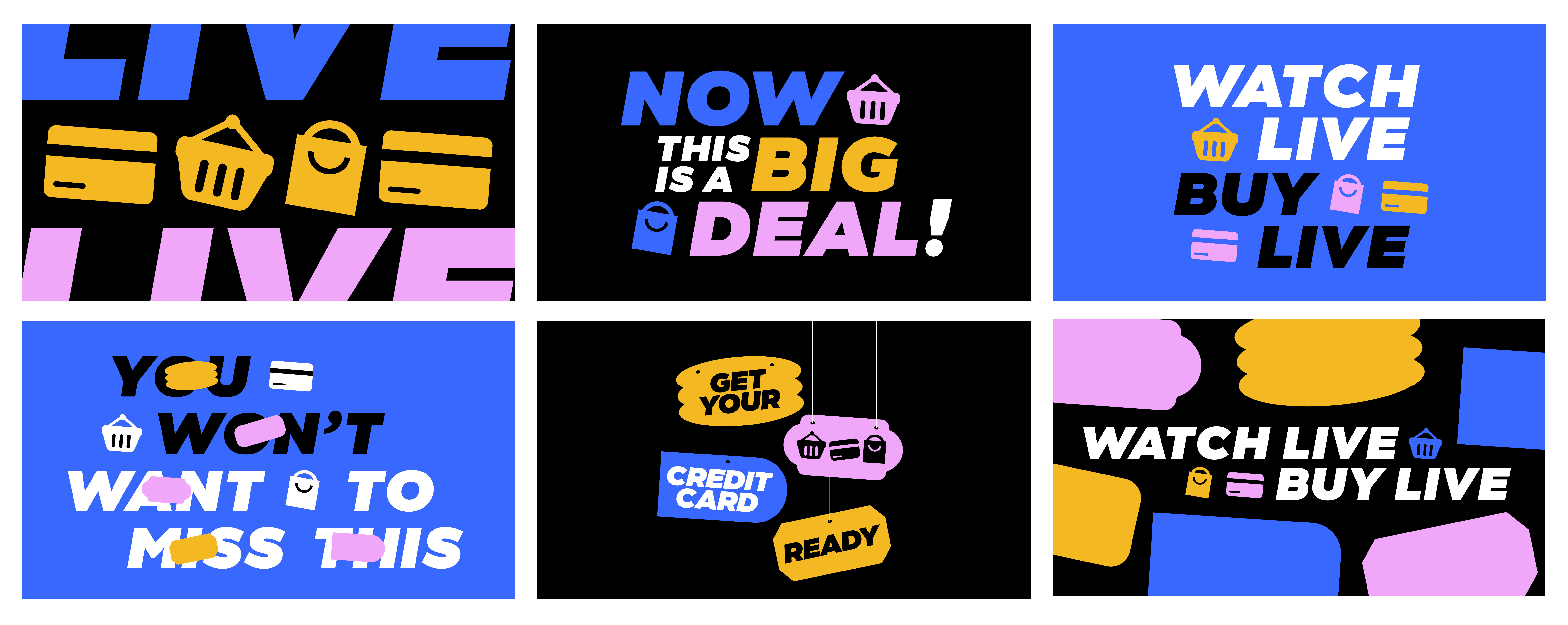
Pairs bold, sans serif typefaces with custom-made chunky icons that are meant to represent various features of the shopping experience (cart, basket, credit card, receipt, hang tag, etc). Icons will be placed alongside text. The icon set allows for “instagramable” moments on social posts, transitions within motion graphics, and set the foundation for the show’s identity. Icons can also be used to align with particular products that may be featured during the show (ex. someone is selling a mop; we use a mop icon throughout that episode’s graphics). Icons can also help lead segments of the show (ex. when it is time to purchase the item, the credit card or shopping basket icons are displayed). Pulling inspiration from hang tags, clothing size stickers, and price tags, we will create a set of retail stickers/tags which will then be used as design elements. The stickers and tags can be stacked, layered, and roll onto or peel off the screen tocreate a sense of 3D movement.
Design Direction 4:
American Dream
This concept pulls inspiration from the show’s creative strategy. Each bucket focuses on America and how Joy Mangano embodies the American Dream. By using a red, white, and blue color palette, we can create a visual association between the show and Joy’s embodiment of the American Dream.
